Dashboard
When you log in to your TelQ account, the Dashboard is the first page you see. It provides a visual overview of your testing activity — helping you monitor test volumes, user performance, and global coverage at a glance.
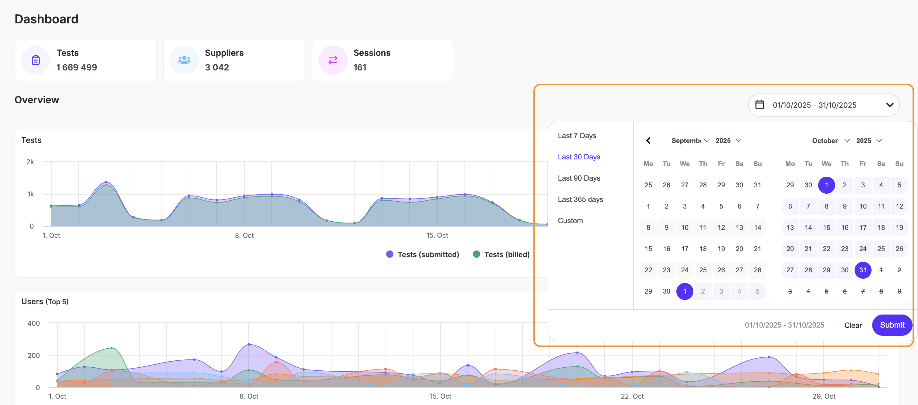
Date Range Filter
Use the date selector in the top-right corner to adjust the period displayed across all graphs.
You can choose from predefined options or create a custom range.
Available options:
Last 7 Days
Last 30 Days
Last 90 Days
Last 365 Days
Custom Range (select start and end dates manually)
All dashboard data automatically refreshes to reflect your selected range.
Overview Graphs
Tests Overview
This chart shows the number of tests submitted and tests billed over time.
Tests (submitted): Total number of test requests created by all users.
Tests (billed): Tests successfully completed and billed.
Use this graph to analyze traffic patterns, detect peaks or drops in activity, and monitor the ratio of billed to submitted tests.
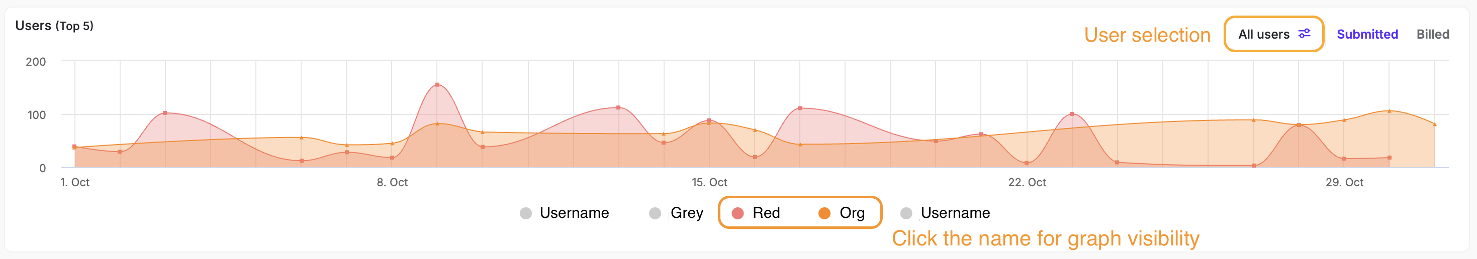
Users Overview
The Users graph displays testing activity for your most active users.
The top 5 users are shown by default.
Each user is represented by a distinct color.
You can toggle between Submitted and Billed views to compare activity types.
User Selection
An icon above the chart opens the User Picker, where you can view all users linked to your account.
Any user can be added or removed from the graph by checking or unchecking their name.
Unselected users are concealed from view, allowing you to focus on specific individuals or teams.
Services Overview
The Services chart breaks down your testing activity by execution method and type of testing service.
Switch between UI and API tabs in the top-right corner to view the corresponding data.
UI Tests Includes
Live Number Testing (LNT)
Manual Testing (MT)
CLI Testing
Mobile Originated (MO)
Scheduler
API Tests Includes
Live Number Testing (LNT)
Manual Testing (MT)
CLI Testing
Each service is represented by a unique color to help you visually compare volumes and patterns between test types.
Service Selection
Below the chart, you can toggle individual services on or off.
When a service is unclicked, its data line disappears from the chart, making it easier to focus on smaller-volume services.
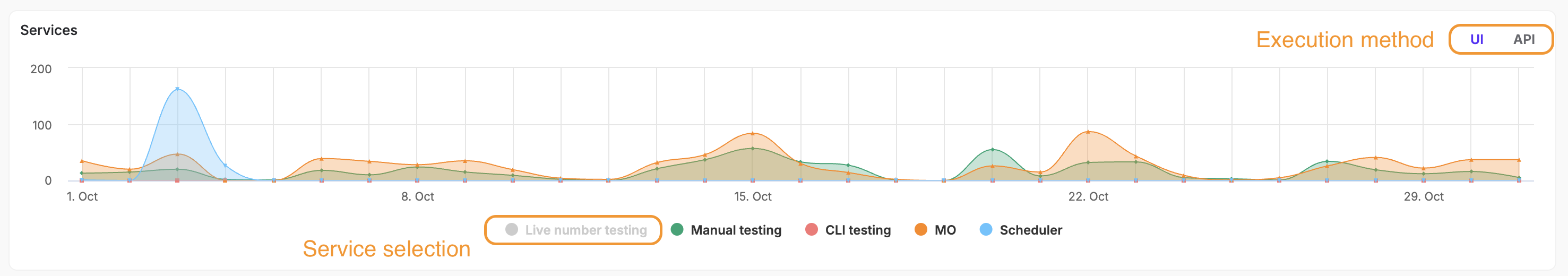
Because LNT often generates the largest share of tests, hiding it can reveal more detailed activity trends for lower-volume services such as MT or CLI.
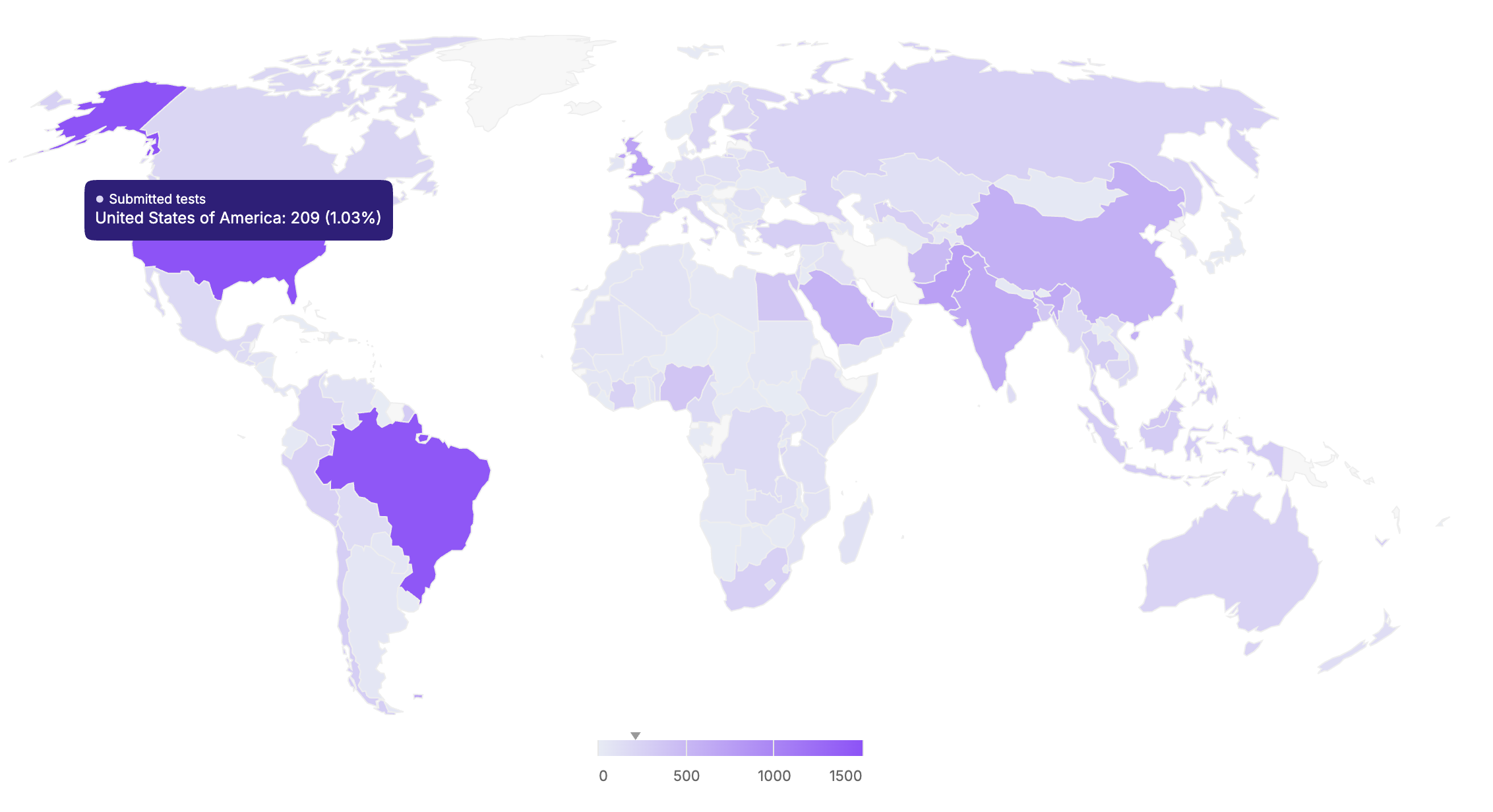
Geographic Map
The World Map shows the global distribution of your tests. Countries are shaded based on activity level — darker areas represent higher volumes.
Hover over any country to see the exact number of tests performed there.
This view helps identify testing hotspots and geographic coverage patterns across your destinations.